CountDarts has looked different since November 2026. I redesigned it from the ground up so that it fits darts instead of looking like just any app.
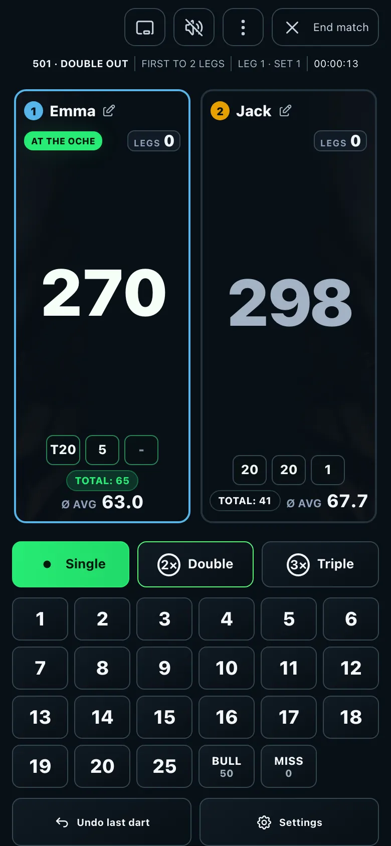
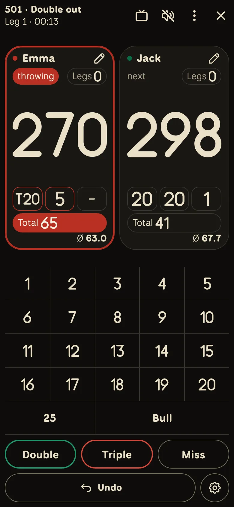
What stays the same
- Your data: players, statistics, history and running games are all still there. You don't have to move anything.
- The rules: X01, Cricket, party games and training score exactly as before.
- All features: bot, online play, TV view, camera, caller and settings are all still there, some in a new place.
- Free and without ads: the design doesn't change that.
Why a new design?
The previous design was built from standard components, the same ones many apps and other darts scorers use. It worked, but it looked like a lot of other things and differed a little from page to page. The new design gives CountDarts a face of its own. It's the same on every page, in the browser as well as in the apps.
New: the number ring
At the board you know that 5 sits to the left of 20 and 1 to the right. The number ring is built exactly like that: the numbers are in the order of the board, with Double and Triple in the middle. If you throw regularly, you find every segment without searching.
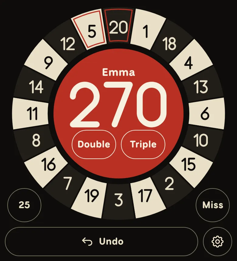
- With one thumb: the phone sits in one hand, and your thumb reaches every segment and the middle.
- Tapped as thrown: for treble 20 you tap "Triple" in the middle and then 20 at the top. A single segment is just one tap.
- Neighbours side by side: if a dart lands one number off, the key is one along too.
- Checkout in view: the next target of the suggested route is marked with a dashed line in the ring, and so is Double or Triple.
New players start with the number field, because the ring assumes you know the order of the board. After a few games the app offers it. You can also turn it on at any time under Settings → Input and switch back the same way. On very small screens the app shows the number field automatically.
Try the ring for a whole leg before you decide. You already know the order from the board.
Everything comes from the board


- The logo is 180 in wire digits, with a dart stuck in the zero.
- The digits are drawn from bent wire, like the numbers around the edge of the board.
- The colours are black and sisal, the material of the board. Red and green appear where they do on the board: on double and triple, and as the colours of the first two players.
- Black
- Sisal
- Red
- Green
Built for the distance to the board
The phone usually sits next to the board and is read from two to three metres away. That's why the score left is the biggest number on the screen, text is never smaller than 16 pixels and every button is big enough for your thumb. All contrasts are checked, and the light and dark themes are equally good.
Calm for the game
There are no shadows, gradients or ads. Colour always means something: a coloured area belongs to a player, red next to a word marks an error. So you see at a glance who's up and what they still need.
Where do I find what?
| You're looking for | In the new design |
|---|---|
| Settings during a game | Gear next to "Undo" or Menu (⋮) → Settings |
| Correcting visits, camera, full screen | Menu (⋮) at the top right of the game |
| TV view | TV icon at the top of the game |
| End match | ✕ at the top right of the game |
| Renaming a player | Pencil next to the name; with three or more players, tap the name |
| Number ring or number field | Settings → Input |
| Light or dark | Sun or moon icon at the top, or Settings → Theme |
| Bigger numbers | Settings → Big numbers |
Every setting and what it does is in All settings explained.
The classic version
If you used CountDarts before, you can switch to the classic version until 31 January 2027: through the note at the top or the "Classic version" link at the very bottom of the page. It uses the same players and statistics. After that, there's only the new design.
Tell me what you think
The design keeps improving with your feedback. What are you missing, what can't you find any more, what do you like? I read every message myself.